

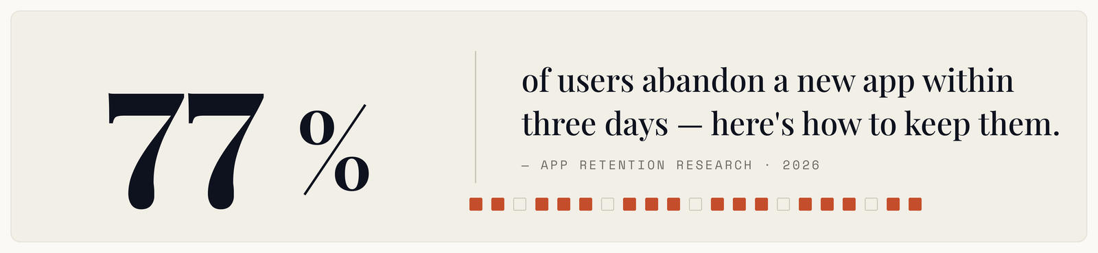
The install was the expensive part. You paid for the ad, won the store listing, survived the download. Then most of those people opened the app once, did not come back, and removed it within a week.
That pattern is normal across the industry, which is precisely why it is worth attacking — everyone is losing the same users, and the fixes are unglamorous enough that most teams skip them.
The first session decides almost everything
Retention curves are steepest at the very start. The drop between install and second open dwarfs everything that follows, which means the entire problem is concentrated in one session lasting a couple of minutes.
That reframes where effort goes. A team polishing week-four engagement features is optimising for an audience that has already left. The leverage is in the first ninety seconds, and almost nobody instruments them properly.
Ask a simple question of your own analytics: of everyone who installed last month, what percentage reached the point where the app became useful? Not registered — useful. Saw their data, completed the thing they came for, got the value promised by the ad. That number is usually far lower than teams expect, and it is the number that matters.
The four things that kill the first session
A wall before any value. Sign-up screens, permission prompts, and tour carousels stacked in front of the product. Every one is a request before anything has been given. Users who have not yet seen value have no reason to pay a cost, and each screen sheds a share of them.
Permission requests without context. A location prompt on launch, before the user knows why, gets denied — and on both platforms a denial is sticky and awkward to reverse. Ask at the moment the feature needs it, after explaining what it does.
An empty state that looks broken. A new account has no data, so the screen designed around content shows nothing. The user cannot tell whether the app is empty or failing. Empty states are the highest-traffic screens in your app and usually the least designed.
Slow cold start. First launch does the most work — downloads, initialisation, migrations. It is also the launch where the user has the least invested. A few seconds of blank screen reads as broken software.
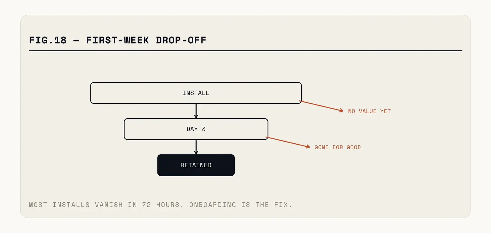
Fig. — Every gate before the value point sheds users who never saw why they installed.
What actually moves the number
Delay the account. Let people use the app first and register when they need something that requires an account — saving, syncing, paying. This one change reliably outperforms every improvement to the sign-up form itself, because the best form is the one nobody had to fill in yet.
Seed the empty state. Sample data, a template, a pre-filled example someone can edit. A user staring at a blank screen must invent a task; one looking at a filled example just changes it. That is a much easier first action.
Make the first action tiny. Not "set up your workspace" but one tap that produces a visible result. Momentum in a first session is built from small completions, and the app that asks for a five-minute setup gets abandoned at minute two.
Earn permissions. Explain in your own screen what a permission unlocks, then trigger the system prompt when the user opts in. The system dialogue is a one-shot resource; spending it cold is wasteful.
And instrument the funnel properly. Install, first open, past each gate, first value, second open. Most teams measure installs and daily actives and cannot say where in between people are leaving, which makes every fix a guess.
The acquisition mismatch nobody checks
A share of week-one churn is not an onboarding failure at all. It is a promise problem, and it shows up as a retention number.
If your ad promises free unlimited access and the app asks for a card on screen three, those users were never going to stay. They churn quickly, they leave poor reviews, and they drag down every retention metric you use to judge onboarding changes — so you optimise a funnel that was fed the wrong people.
Segment by acquisition source before drawing conclusions. Organic search installs and paid social installs behave completely differently, and averaging them hides both. It is common to find one channel retaining several times better than another, at which point the useful action is a budget decision rather than a design one.
The same applies to store listing screenshots. They are an implicit promise, and a mismatch between them and the first screen is a small betrayal that costs you the session.
The re-engagement question
Push notifications are the obvious lever and the one most likely to backfire. A notification sent before the user understands the app is noise, and noise gets notifications disabled permanently — after which your only re-engagement channel is gone for the life of the install.
The sequencing that works: deliver value, then ask for notification permission with a specific reason, then send messages that reference something the user actually did. Generic re-engagement blasts perform poorly and cost you the channel.
Email remains underrated for this, largely because it survives an uninstall. Someone who deleted your app can still be brought back by a message they see; someone who disabled notifications cannot.
Where to start this week
Install your own app on a phone you have never used it on, from the store rather than a build, and watch someone else do the same. Not a colleague — someone who has never seen it.
Count the taps before they see something useful. Count the seconds. Note every screen that asks for something before giving anything. That list, in order, is your retention backlog, and it is usually shorter and more embarrassing than any analysis would suggest.
Cutting taps out of a first run is unglamorous work, and it's a standard part of how we build and rescue mobile apps. If your day-one retention embarrasses you, send us the funnel — we've seen worse.