

Every layout in your app carries an assumption nobody wrote down: that the screen is one rectangle, it stays the same shape while the app is open, and the user is holding it in one hand about thirty centimetres from their face.
Three of those are now optional.
The assumption that is actually breaking
It is tempting to file this under responsive design and move on. Developers have handled multiple screen sizes for fifteen years — this is just more sizes.
That framing misses what is different. Responsive design assumes the viewport is fixed at launch. You check the width once, pick a layout, and render. Foldables break that: the screen changes shape while your app is running, mid-task, sometimes mid-keystroke. An app that reads its dimensions on startup and caches a layout decision will do something visibly wrong the first time someone unfolds.
The second broken assumption is that the whole screen is usable. A folded device has a hinge running through it. Content placed under that crease is not merely ugly — it is unreadable, and a button there is unreliable.
Foldables: one device, two devices
The useful mental model is that a foldable is two devices sharing a process, and your app has to be both.
Folded, it is a narrow phone — often narrower than a standard handset, which surprises teams whose minimum width assumptions were set by an iPhone. Unfolded, it is a small tablet with a squarer aspect ratio than any tablet you have tested on.
The transition between them is where the engineering lives. When someone unfolds mid-task, three things must survive: their scroll position, their input state, and their focus. Losing a half-typed message because the user opened the device is the kind of bug that gets an app deleted, and it is the default behaviour if you let the OS recreate your activity without handling it.
There is a middle state too. Devices that stay half-open — propped on a desk, camera up top, content below — enable genuinely useful modes for video calls and photography. Supporting it is optional. Knowing it exists so your layout does not collapse into something absurd is not.
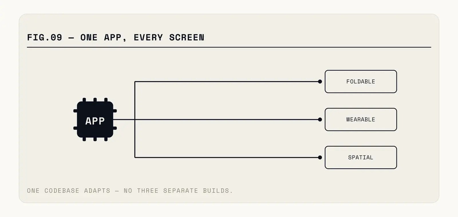
Fig. — One app, three postures. The transitions are the hard part, not the layouts.
Wearables have a different budget entirely
A watch is not a small phone, and treating it as one produces the apps nobody opens twice.
The constraint is not screen size. It is interaction budget — the total attention a user will spend before abandoning the task. On a phone that budget is minutes. On a watch it is roughly the length of time someone will hold their arm up, which is a few seconds.
That single fact should determine what you build. A watch app that requires scrolling through a list, selecting an item, and confirming has already exceeded the budget. One that shows the single most relevant thing, with at most one action, fits.
The honest answer for most products is that the watch surface is a notification and a glance, not an app. Delivery tracking, the boarding pass, the one number that matters. Building a full navigation hierarchy for a watch is a common and expensive mistake — the effort goes in, the usage never arrives, and the team concludes wearables do not matter when what they built was a phone app on a small screen.
Spatial: interesting, and not yet your problem
Headsets attract a disproportionate share of strategy conversation relative to their installed base, and it is worth being blunt about the timeline.
For the overwhelming majority of apps, the correct spatial strategy this year is to make sure the existing app runs acceptably in a compatibility window and spend the engineering elsewhere. The device count does not yet justify a bespoke build for a general-purpose consumer or business app.
The exceptions are real but narrow: training and simulation, complex 3D data, remote assistance where seeing the other person's hands genuinely changes the outcome. If your product is in one of those, the calculus is different and it is worth serious investment. If it is not, an app store presence on a platform with few users is a vanity project with a maintenance cost.
The testing problem
Here is the practical obstacle that stops most teams, and it is not design or code.
You cannot test a foldable properly without a foldable. Emulators handle the geometry — they will show you a folded and unfolded layout, and they will fire the configuration change. What they will not reproduce is how the hinge feels under a thumb, whether the crease sits across your primary action, or how the transition looks at full speed on real hardware.
The same holds for watches, more acutely. A watch face rendered at 400% zoom on a desktop monitor tells you nothing about legibility on a wrist in daylight while walking.
Budget for at least one physical device per form factor you claim to support. That is a modest hardware cost against the alternative, which is discovering your layout problem from a one-star review that describes it badly.
Automated testing helps with the mechanical part. A test that rotates through every window size class and asserts nothing overflows, no interactive element lands under the hinge, and state survives a configuration change catches most regressions cheaply. Set that up once and it protects you on every device that arrives later.
What actually changes in your code
Stop reading device type and start reading window size, continuously. Both major platforms now expose size classes that describe the current window rather than the hardware, and both fire updates when it changes. Code that branches on "is this a tablet" is already wrong on a foldable.
Make state survival explicit. Assume your UI can be destroyed and recreated at any moment, and that anything not deliberately saved is lost. This is well-trodden ground on Android and newly relevant to a lot of iOS code.
Build for a range, not for breakpoints. Layouts pinned to three specific widths break on the fourth device, and there is always a fourth device. Continuous adaptation — content that reflows rather than switching between fixed designs — costs more up front and stops costing anything afterwards.
And handle the hinge, which platform APIs will describe for you: where it is, which way it runs, whether the device is folded. Ignoring it puts a button in a crease.
One more thing that catches teams out: input methods multiply alongside screens. An unfolded device is large enough that people attach keyboards. A watch takes voice and a crown. A tablet-sized foldable gets used with a stylus. Code that assumes touch is the only input will feel subtly broken on all of them — no keyboard shortcuts, no focus ring, no sensible tab order.
That work is mostly accessibility work wearing a different hat. An app with a proper focus order and real keyboard support already handles most of it, which is another reason the accessibility investment keeps paying for itself in places nobody predicted.
How to prioritise this
Check your analytics before deciding anything. Foldable share varies enormously by market — meaningful in parts of Asia, negligible elsewhere — and the right investment depends on your users, not on the general trend.
If you find real foldable usage, the work is worth doing properly and it is not enormous: continuous layouts, state preservation, hinge awareness. Most of that improves your tablet experience as a side effect, which is the part that makes the business case.
If you find watch users, build the glance, not the app.
There is a commercial angle worth raising with whoever holds the budget. Foldable owners skew toward the premium end of every market they exist in — these are expensive devices, bought deliberately. If your product monetises, that segment is disproportionately valuable relative to its share of installs, and an app that behaves badly when unfolded is failing in front of exactly the users you would most like to keep.
The same argument runs the other way for watches. Watch users are engaged but the surface generates almost no direct revenue, so the investment case rests on retention and habit rather than conversion. Being honest about which of those you are buying prevents the common outcome where a team ships a watch app, sees no revenue movement, and quietly abandons it.
And if you find neither, the useful move is to stop writing code that will make this hard later. An app built on window-size adaptation and disciplined state handling supports whatever shape arrives next without a rewrite. An app built on three hardcoded breakpoints and cached layout decisions will need one, every time.
Window-size adaptation and disciplined state are how we build apps that survive whatever hardware ships next — worth checking yours against before the next form factor lands.