


Open any banking app and count the screens you never use. The bill-splitting flow, the investment tab, the rewards carousel, the thing that offers you a loan. Someone shipped all of it, and for any individual user most of it is furniture.
Generative UI is the argument that this is a solvable problem — that the screen should be assembled for the person opening it rather than designed once for everybody.
What this is not
The term gets used for two completely different things, and conflating them wastes a lot of meetings.
The first is design tooling: describe a screen, get a mockup or some code. That is generative design. It happens before you ship, a human reviews the output, and the app itself is as static as it ever was. Genuinely useful, not what this article is about.
Generative UI means the interface is assembled at runtime. The app decides, while the user is holding it, which components to show, in what order, with what content — based on who they are and what they appear to be trying to do. No designer approved this specific arrangement, because this specific arrangement did not exist until three seconds ago.
That distinction is the whole reason it is contentious.
Why this is suddenly plausible
Server-driven UI is old. Airbnb, Spotify, and most large e-commerce apps have shipped it for years: the server sends a list of component types with data, the client renders them, and the layout can change without an App Store release. That solved the deployment problem — you could reorder a home screen without waiting a week for review.
What it never solved was the decision problem. Someone still had to write the rules. Show the promo banner to users in segment B during December. Move the reorder button up for customers with more than three past orders. Every rule was hand-authored, and the combinatorics defeated everyone past a certain point.
Language models change that half. Given a description of what components exist, what the user has done, and what they seem to want, a model can compose a layout without anyone writing the rule. The rendering half — a client that draws whatever component list it receives — is a solved problem your team may already have.
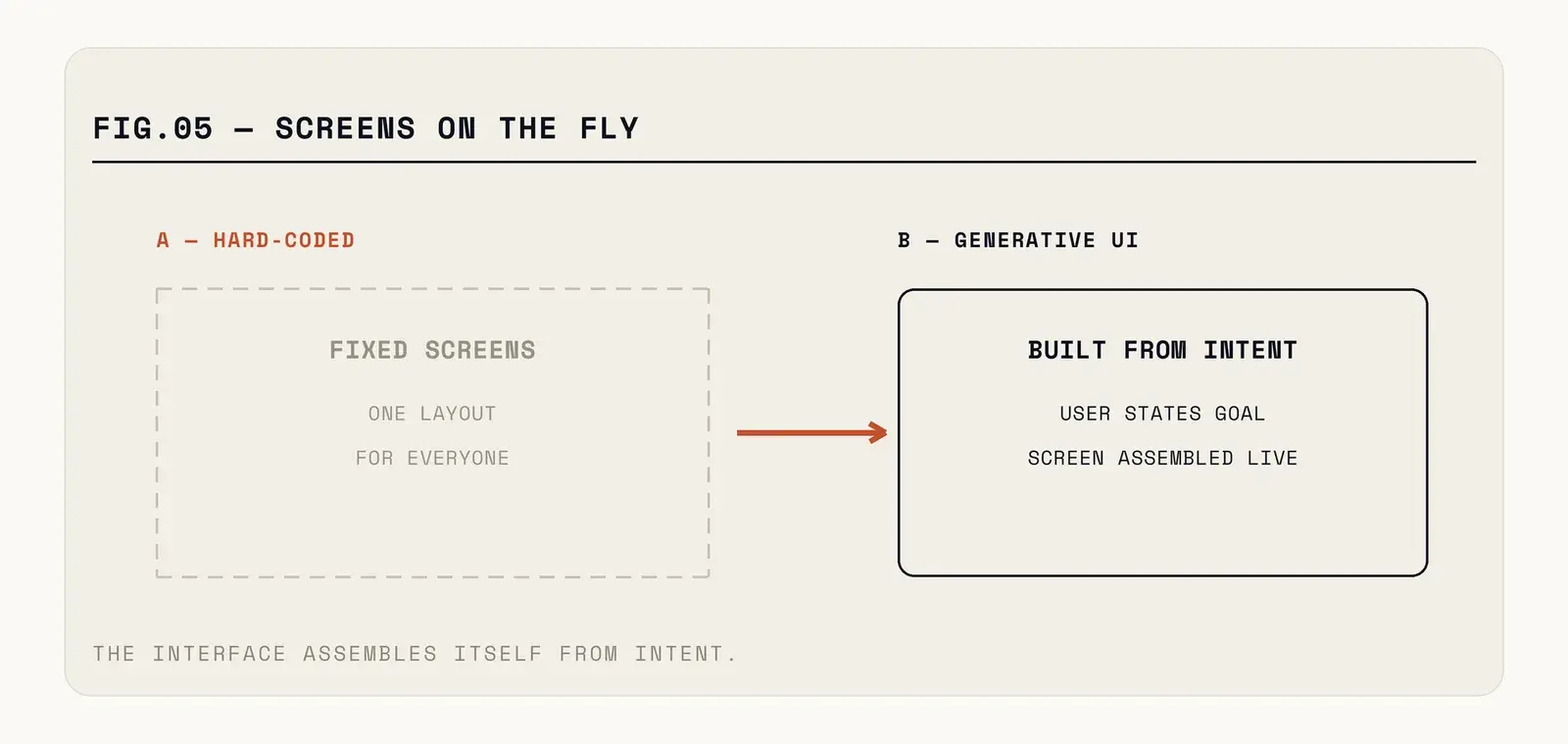
Fig. — The model chooses from a registry it cannot exceed. Nothing is invented at render time.
Where it genuinely earns its place
Start with search and discovery, because the payoff is obvious. A query for "waterproof jacket under 8000" currently returns a grid, because a grid is what the screen is. A generated response might return a comparison table with the three closest matches, a note about sizing, and a filter chip for the constraint the user expressed. Same data, arranged for the question actually asked.
Support flows are the second. Most in-app help is a decision tree someone drew in 2021. An interface that assembles the specific steps for the specific problem — with the user's own order details already filled in — removes the navigation entirely.
Onboarding is the third and the most measurable. A new user who arrived from an ad about expense tracking should not see the same six-card tour as one who came for invoicing. Adapting the first session to the intent that brought them is where retention moves, and retention is where the money is.
What these share: a genuinely wide space of user intent, and content that already exists in structured form. Generative UI does not create new capability. It rearranges what you have.
The problems the demos skip
Here is the honest list, and it is why adoption is slower than the enthusiasm suggests.
Testing becomes probabilistic. Your QA process assumes a finite set of screens. When the screen is composed at runtime, you cannot enumerate them. Teams end up testing the component registry exhaustively and the composition statistically — a real change in how you think about correctness, and one that makes some organisations deeply uncomfortable.
Accessibility is easy to break. A screen reader depends on a sensible traversal order and meaningful labels. If a model reorders components, the reading order changes with it. Every component needs its accessibility contract baked in rather than added per-screen, which is good practice anyway but is now non-negotiable.
Latency is unforgiving. Users tolerate a spinner on a network fetch. They do not tolerate one before the interface exists. Practical deployments render a fast default layout immediately and let the generated version replace or refine it, which means building both paths.
Consistency erodes quietly. Your design system exists so the app feels like one product. A composition engine optimising each screen locally will happily produce a coherent screen that feels nothing like the previous one. Constraints have to be encoded — this component never appears above that one, never more than two calls to action — and that constraint layer is most of the engineering work.
Debugging changes shape. When a user reports that something looked wrong, you need to reconstruct what they saw. That means logging the composition decision, its inputs, and the rendered result for every session you might need to explain. Storage and privacy questions follow immediately.
Who decides what good looks like
There is an organisational problem underneath the technical one, and it surfaces about three weeks into any serious attempt.
Designers are used to owning screens. In a generative system they own components, constraints, and the definition of a good composition — which is a genuinely different job, closer to writing a grammar than drawing a layout. Some designers find that liberating. Others correctly point out that they can no longer look at the product and know what users see, which was previously the entire basis of their craft.
Product managers hit the same wall from another angle. Sign-off used to mean reviewing a Figma file. Now it means reviewing a space of possible outputs, which cannot be done by looking. The teams that handle this well build a gallery view — a tool that renders a hundred sampled compositions from real user contexts, so a human can scan for anything embarrassing before it ships.
Build that tool early. Every team that skipped it built it later, after something went out that nobody had ever seen.
What it actually costs
The component registry is the real project. Every element the model can place has to be genuinely self-contained — no assumptions about what sits above it, no layout that breaks at an unexpected width, complete accessibility metadata, sensible behaviour with missing data. Most existing component libraries are not this. They are components that work in the places they are currently used.
Budget for the constraint system too, because it is where the quality lives. And budget for inference: a model call on every screen composition is a per-session cost that scales with engagement, which is an unusual and slightly uncomfortable shape for a mobile app's economics.
The teams doing this successfully generate layouts for a handful of high-value surfaces, not for the whole app. Settings screens do not need this. Neither does checkout, where predictability is worth more than relevance.
How to start without betting the app
Pick one surface where user intent genuinely varies — search results, the home feed, the help flow. Build the component registry for that surface properly, with the accessibility and layout independence done seriously. Ship it behind a flag with a static fallback that renders when the model is slow, unavailable, or returns something invalid.
Then measure the thing that matters, which is not engagement. Engagement goes up when you rearrange anything. Measure task completion — did the person find the jacket, resolve the issue, finish the setup — and compare against the static layout honestly.
A word on the fallback, because it decides whether this survives contact with production. The static layout you render first is not a degraded experience — it is the experience for every user whose composition call times out, every user on a bad connection, and every user during the inevitable model outage. If the fallback is bad, you have built an app that is occasionally bad for reasons users cannot understand. Design the static version as though it were the only version, then let the generated one improve on it.
Most apps do not need this yet. The ones that do are the ones where users arrive with wildly different goals and currently navigate past most of what you built to reach the one thing they came for. If that describes your app, the furniture problem is already costing you something. It just does not show up in any dashboard, because nobody files a complaint about a screen they scrolled past.
Finding the screens people scroll past is a design problem before it's an AI one — our UI/UX practice starts there. Ask for a furniture audit.